Predicting the possibility of a passenger to survive from Titanic sinking
Hi... in this task we will predict the possibility of a passenger to survive from Titanic ship sinking.
We gonna use Logistic Regression for this task.
We gonna use Titanic dataset for data analysis and ML model testing.
But, before that let's quickly recap what is logistic regression.
Logistic Regression
- Logistic regression comes under the category of supervised machine learning.
- Logistic regression is a classification algorithm used to assign observations to a discrete set of classes.
- Logistic regression transforms its output using the logistic sigmoid function to return a probability value which can be mapped into two or more discrete classes.
- In this example, the model will predict that a passenger would survive or not.
We gonna complete the task in the following steps:
1. Importing Libraries
2. Data wrangling
3. Preparing data for the model
4. Training the ML model
5. Testing the ML model
6. Checking the accuracy
7. Visualizing the model
1. Importing libraries
First of all, we will import all the required libraries for our task.
For this task, I imported the Sklearn, pandas, seaborn and matplotlib libraries.
code
import pandas as pd
import seaborn as sns
from matplotlib import pyplot as plt
from sklearn.model_selection import train_test_split
from sklearn.linear_model import LogisticRegression
from sklearn.metrics import confusion_matrix
from sklearn.metrics import accuracy_score
from sklearn.metrics import classification_report
from sklearn.metrics import roc_auc_score
from sklearn.metrics import roc_curve
2. Data wrangling
In this section, we will read the dataset and analyse the data.
We will also fix the missing values in the data and also try to clean the data.
First of all, we will try to read the CSV file and see if there any missing values.
code
df=pd.read_csv('titanic.csv')
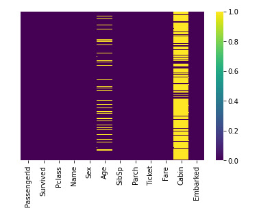
sns.heatmap(df.isnull(), cmap='viridis', yticklabels=False)
from the above heatmap, we can see that the missing values are present on the cabin and on the ages column.
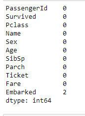
But if you want to see the missing values in numbers then write
code
df.isnull().sum()
Here, we can see the 177 missing values present on the age columns and 687 missing values present on the cabin and 2 missing values on the embarked columns.Now we will try to do some analysis on the data, we will try to see what the majority of people survived what gender of people survived most.
code
sns.countplot(df.Survived, data=df)
From the above bar graph, we can see that more than 500 people are unable to survive on from ship.
Now we will try to see the survival rate of what gender is more.
code
sns.countplot(df.Survived,hue=df.Sex)
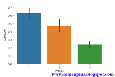
Now we will observe the people who survived were belong to which class.
code
sns.barplot(df.Pclass,df.Survived)
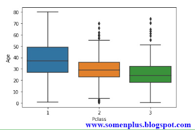
Now in our dataset, we need to fill missing values on the age columns for that first of all we need to find the average age of passengers according to the class and replace the missing values with average values.
code
sns.boxplot(df.Pclass,df.Age)
From the above graph, we can see that the average is of people belong to first-class is about 39, for the second class is about 30 and for the third class is between 20 to 30.
Now we will create impute function and replace the missing values by these average values.
code
def impute_age(cols): # impute function
Age=cols[0]
Pclass=cols[1]
if pd.isnull(Age):
return int(df[df['Pclass']==Pclass]['Age'].mean())
else:
return Age
df['Age']=df[['Age','Pclass']].apply(impute_age,axis=1) # replacing missing values by mean of age according to class
df.isnull().sum()
df.drop('Cabin',inplace=True,axis=1)
df.isnull().sum()
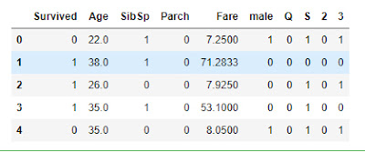
Now the most important part, our dataset consists of categorical data inside Embarked, P-class and Sex columns, we can't feed these data directly to the model.
So we need to convert these categorical attribute into numerical attribute using "one-hot encoding".
These new attributes are called Dummy variables.
After creating the dummy variables we will concate them to our dataset.
code
Sex=pd.get_dummies(df.Sex,drop_first=True)
Embark=pd.get_dummies(df.Embarked,drop_first=True)
Pclass=pd.get_dummies(df.Pclass,drop_first=True)
df.drop(['PassengerId','Name','Embarked','Sex','Ticket','Pclass'],axis=1,inplace=True)
df.head()
df=pd.concat([df,Sex,Embark,Pclass],axis=1)
df.head()
3. Preparing data for the ML model
In this section, we will prepare our data for the model. We will use the built-in function of the sklearn to split the dataset into training data and testing data.
code
x=df.drop('Survived',axis=1)
y=df.Survived
x_train,x_test,y_train,y_test=train_test_split(x,y,test_size=0.3,random_state=50)
4. Training the ML model
We gonna use Logistic Regression for our model and feed our prepared training data to the model.
code
model=LogisticRegression(random_state=50)
model.fit(x_train,y_train)
print('model trained')
5. Testing the ML model
Now its time to check the model, We will feed our test data i.e. our passenger's details and the model will predict that the passenger had survived or not.
code
prediction=model.predict(x_test)
target_names=['Not survived','Survived']
df=pd.DataFrame({'actual value':y_test,'predicted value':prediction})
df['label']=df['predicted value'].replace(dict(enumerate(target_names)))
df.head()
6. Checking the accuracy
We will check the accuracy using the confusion matrix, and classification report.
code
print(classification_report(y_test,prediction))
from the classification report, we can see that accuracy is 0.81 i.e. 81%.
confusion_matrix(y_test,prediction)
7. Visualizing the Model
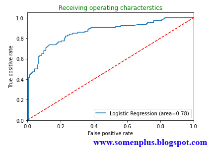
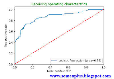
In this section, we will visualize our model using the AUC-ROC method.
code
roc=roc_auc_score(y_test,model.predict(x_test))
fpr,tpr,thresholds=roc_curve(y_test,model.predict_proba(x_test)[:,1])
plt.plot(fpr,tpr,label='Logistic Regression (area=%0.2f)'%roc)
plt.plot([0,1],[0,1],'r--')
plt.xlim([0.0,1.0])
plt.ylim([0.0,1.05])
plt.xlabel("False positive rate")
plt.ylabel("True positive rate")
plt.title('Receiving operating characterstics',color='green')
plt.legend(loc='lower right')
plt.show()
