Hi... In this project, we will create a machine learning model and classify data clusters for different category of flowers.
The dataset we gonna use is Iris dataset.
The category of the flower will be decided by the features (sepal length, sepal width, petal length, petal width)
But first, let's quickly recap what is k-mean.
K-means
- K-means comes under the category of unsupervised machine learning.
- The k-means algorithm creates clusters of data by separating samples in n groups of equal variance, minimizing criterion known as inertia.
We will cover this project on the following points.
1. Importing all required libraries
2. Loading and preparing data
3. Using Elbow Method
4. Creating a K-means classifier model
5. Plotting graph for Iris Dataset and observe
6. Using Principle component method (PCA)
7. Plotting graph for Classified dataset
1. Importing all required libraries
First of all, we will import all the required modules and libraries for our project. In this project, we will use the pandas, NumPy, matplotlib and sklearn.
code.
import pandas as pd
import numpy as np
from matplotlib import pyplot as plt
from sklearn.datasets import load_iris
from sklearn.decomposition import PCA
from sklearn.cluster import KMeans
2. Loading and preparing data
This section we will use the built-in iris dataset in the sklearn module. we will also observe all its features and arrange the data inside the data frame.
code.
iris=load_iris()
iris['data'][:5]
iris['target'][:5]
iris["feature_names"]
data=pd.DataFrame(data=np.c_[iris['data'],iris['target']], columns=iris['feature_names']+['target'])
data.head()
3. Using Elbow Method
The elbow method is used to get the optimum value of K in K-means.
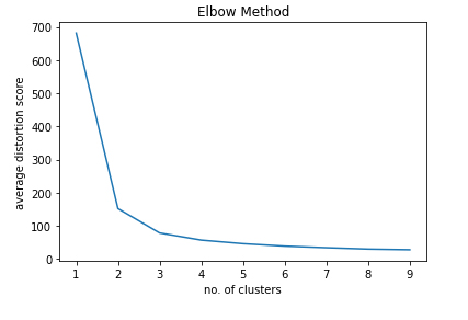
The elbow-method runs k-means clustering on the dataset for a range of values for K (say from 1-10) and from each value of K computes an average score for all clusters.
code.
sse=[]
k_range=range(1,10)
for k in k_range:
kmeans=KMeans(n_clusters=k)
kmeans.fit(iris['data'])
sse.append(kmeans.inertia_)
plt.plot(k_range,sse)
plt.title("Elbow Method")
plt.xlabel("no. of clusters")
plt.ylabel("average distortion score")
plt.show()
In the above graph the elbow point is 3. Hence we will create 3 classified clusters.4. Creating a K-means classifier model
Now its time to create the Kmeans clustering model. For that, we will use the Kmeans model and fit the iris features and get the predicted values.
After getting the predicted values to attach all the values to the target column of the dataset. Now collect all the data related to target=0, 1, and 2.
and finally, calculate the centroids using the cluster centre.
code
model=KMeans(n_clusters=3)
model.fit(iris['data'])
data.target=model.labels_
df1=data[data.target==0]
df2=data[data.target==1]
df3=data[data.target==2]
model.cluster_centers_
5. Plotting graph for Iris Dataset and observe
Let's plot our model prepared dataset and let see how it looks.
code
plt.figure(figsize=(12,4))
plt.subplot(1,2,1)
plt.scatter(df1[['sepal length (cm)']],df1[['sepal width (cm)']],color="red",label="setosa")
plt.scatter(df2[['sepal length (cm)']],df2[['sepal width (cm)']],color="green",label="versicolor")
plt.scatter(df3[['sepal length (cm)']],df3[['sepal width (cm)']],color="blue",label="verginica")
plt.scatter(model.cluster_centers_[:,[0]],model.cluster_centers_[:,[1]],color="cyan",label="centroid")
plt.title('sepal length vs sepal width')
plt.legend()
plt.subplot(1,2,2)
plt.scatter(df1[['petal length (cm)']],df1[['petal width (cm)']],color="red",label="setosa")
plt.scatter(df2[['petal length (cm)']],df2[['petal width (cm)']],color="green",label="versicolor")
plt.scatter(df3[['petal length (cm)']],df3[['petal width (cm)']],color="blue",label="verginica")
plt.scatter(model.cluster_centers_[:,[2]],model.cluster_centers_[:,[3]],color="cyan",label="centroid")
plt.title('petal length vs petal width')
plt.legend()
6. Using Principle component method (PCA)
PCA is an Unsupervised, non-parametric statistical technic primarily used for dimensional reduction in machine learning.
PCA can also be used to filter the noisy dataset.
code
pca=PCA(n_components=2)
xp=pca.fit_transform(iris['data'])
xp
newdf=pd.DataFrame(xp,columns=['principle_component1','principle_component2'])
newdf
newdf['target']=model.labels_
newdf
7. Plotting graph for Classified dataset
Video Demonstration
Thanks for your time and stay creative...


